Binance 2.0: Trading Evolved. 9 Features to Explore with the Binance.com Upgrade.

Binance has been in operation for just shy of two years, and the amount of changes that we’ve been through in that period has been remarkable. We’ve made numerous reassessments on how we can grow further, and one thing that keeps coming up is our commitment to making our user experience better.
Hence, Binance 2.0 was born. Our team explored how our Binancians use the website and identified a lot of the areas where we can improve the way users interact with our platform. We have now started launching the new design to some Binance users, with total rollout anticipated in the coming days.

Check out the new Binance.com website here. For other languages in addition to English, here are the links to 14 other languages supported by Binance:
Also, check out this brief video below the evolution of trading on Binance. Subscribe to our YouTube channel here!

Here are some of the things we revamped for the website.
1. Margin trading is just one tab away
Margin trading, perhaps one of the most anticipated upcoming features on Binance, will be prominently featured on Binance 2.0. On each webpage, for any trading pair that features margin trading, you can toggle between exchange and margin trading options. Margin trading will roll out soon after the upgraded website is activated for all users.

Want to experience margin trading ahead of its upcoming launch? Just fill out this form to qualify. We will soon pick 1,000 lucky participants for the last round of tests for margin trading.

2. One-stop shop for buying crypto using cash
Another major update in the revamped Binance website is a new webpage where you’ll see all your options for buying cryptocurrency using fiat, whether by converting to stablecoins or using your credit card.
For instance, you can now buy BNB using credit cards such as those issued by Visa and MasterCard. (You can also buy Bitcoin, Ethereum, Litecoin, Ripple, and Bitcoin Cash while you’re at it.) In addition, Binance gives you options for using stablecoins like TrustToken and Paxos to either buy or sell.

3. A comprehensive User Center that displays all the information you need in one place
On the revamped User Center, the first thing you see after you log in to your account, we show you more of the information that matters to you, neatly arranged under five tabs.

Through Dashboard, the first tab displayed, see your balances and commissions at first glance, as well as your trading fee level, your balances and volumes, and your open orders, across both exchange trading and margin trading platforms.
Security is still first and foremost, but we now offer you a checklist of what you need to do for account security in a neat box up top, for a more user-friendly experience. For more details on what you need to do for your account, you can go to the Security tab for a complete list of security-related actions.
4. Sitewide visual enhancements
Binance 2.0 isn’t just about new features. The revamp is also about getting it right when it comes to user experience. This involves using a more consistent visual language across different parts of the website. These changes, from icons used to font arrangements, may seem minor when seen individually, but each element contributes to an easier-to-navigate platform for trading and using your Binance account.
5. More information up front about Binance
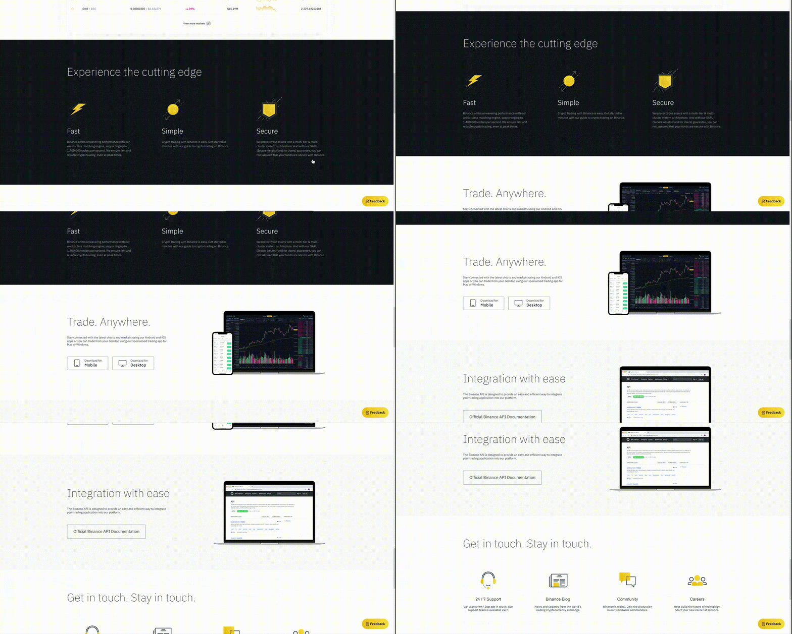
The improved design philosophy underlying the revamped website can be seen from the get-go. At the home page, you’re greeted with an easy-to-view auto-scroll of the latest offerings across the ecosystem, with news bulletins at the bottom, plus an announcement section under the banner slides that displays important news bulletins.

Up next, we offer you the standard markets list, with the option to see them all or just view the first 10, plus an easy-to-understand overview of what Binance offers. For any comments you have about the new design, please let us know through the Feedback button at the bottom of the site.

It’s just not the home page that offers more options right from the get-go. The revamped header and footer also contain links to each division of the Binance ecosystem, as well as quick ways to access important links in the website. You can even change the fiat currency displayed -- choose from US Dollar, Chinese Yuan, Euro, British Pound, Japanese Yen, Russian Ruble, or South Korean Won. You can also change the language displayed on the website among the 15 languages we support.

6. Better support for 15 languages across the website
These 15 languages represent how much Binance has grown over the past two years. And we saw Binance 2.0 as an opportunity to further refine our support for these languages. The Binance team takes the mission of bringing freedom of money to everyone, regardless of country or language.
Hence, we greatly expanded the team that works on translations, making sure that there’s at least one point person who’s a local speaker for each language supported on the website. We believe that more accurate translations lead to a better, more localized user experience. This actually matters, because when we get better at speaking your language, we show how serious we are at serving you well and gaining your trust.
Do you want to see more languages on the Binance website? Let us know here.
7. Learn about what Binance can do through a more interactive About Binance page
One big change we did to the Binance website is on the About Binance section. Two years since its launch, Binance has expanded into an entire blockchain ecosystem that spans several divisions, and the revamped About Binance page gives a better picture of how much Binance has expanded.

In addition, you can explore a new BNB page that gives more information on each of the 80+ use cases for BNB, plus several more in the coming days.
8. Enhanced website performance
Supporting all these new and upgraded features on our website is a better back-end framework. We’ve made the framework for the front-end features of the platform more distinct from the other, more back-end features. This way, the website’s performance and security are enhanced. This results in faster loading speeds for just about every corner of the website, as well as fewer tickets raised for our Support Center. Speaking of which...
9. Get better support fast with our revamped Support Center
Our approach to enhanced user experience extends to one of the areas of the website where it’s needed the most: Customer Support. We’re moving beyond segmenting our support between announcements and FAQs. With the revamped page, you can use the search bar to quickly access potential solutions to your problems, or jump into our most frequently used support topics, including basics and FAQs.

These are just some of the updates and revamps we’ve made already, and there’s more in store for later. Enhancements across the Binance ecosystem will continue beyond Binance 2.0, and we maintain our core philosophy of delivering better experience to all Binancians as fast as possible. That’s what #BUIDL is all about.
Do you have suggestions or comments on the upgraded Binance website? Let us know here.