The K-line chart is the most basic and important indicator in technical analysis. It is also the basic skill of technical analysis. Understanding the K-line chart can add points to your investment decisions.
Investment decisions are ever-changing. In fact, it is nothing more than referring to fundamental and technical analysis to develop the most suitable investment method for yourself. If you want to use technical analysis to interpret the trend of the investment market, you must first learn to read the K-line chart. The K-line chart is the most basic and most important indicator in technical analysis. It is the basic skill of technical analysis, and the colorful technical line chart is actually the result of visualizing complex data.
What is a candlestick chart?
Candlesticks can be said to be a simplified data representation used to record the market performance of a commodity or market over a certain period, forming graphical symbols of price fluctuations. Not only for stocks, but also for the early rice market, foreign exchange rates, futures, raw materials, gold, oil, indices, and anything with numerical fluctuations can be recorded using candlesticks.
The candlestick chart (Candlestick Chart) records the price trajectory of trading over a period, and due to its shape resembling a candle, it is also called candle line or yin-yang line. In Japanese, it is referred to as candle foot. It is said to have been invented over 300 years ago by Honma Munehisa, a rice merchant during Japan's Edo period, to record daily fluctuations in white rice prices and market conditions. The classic Japanese candlestick theory, known as the 'Sakata Method,' was later introduced to the Western financial world in the 19th century through the book 'Yin Line Yang Line.'
What constitutes a candlestick chart?
Period
The calculation periods for candlesticks are as follows:
Price changes within a day are referred to as daily candlesticks.
Price changes within a week are referred to as weekly candlesticks.
Price changes within a month are referred to as monthly candlesticks.
Candlestick main framework
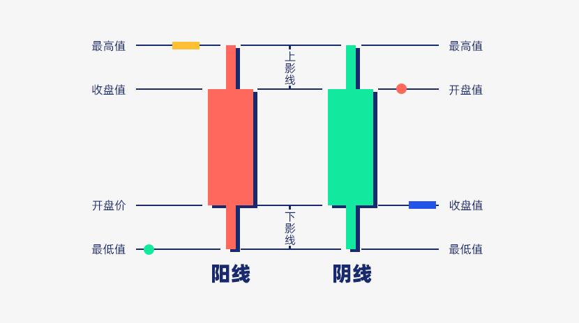
The formation of four price levels, namely opening price, closing price, highest price, and lowest price, is based on the fluctuations in trading prices within a time period.
From opening price to closing price, a solid column is formed, while the highest and lowest prices extend lines from the opening and closing prices outward, thus forming the structure of candlesticks.
Note: In Western financial markets, green indicates a rise and red indicates a fall, while in Asian financial markets, red indicates a rise and green indicates a fall.

Principle of candlestick composition
The thick part represents the opening and closing prices, while the thin part represents the highest and lowest prices.
Bullish candlestick: a red candlestick where the closing price is higher than the opening price.
Bearish candlestick: a green candlestick where the closing price is lower than the opening price.
Upper shadow: indicates the higher price part, with the peak being the highest price.
Lower shadow: indicates the lower price part, with the lowest point being the lowest price.
Four points: opening price, closing price, intra-day highest, intra-day lowest.
Opening price: the price of the first transaction during the selected period.
Closing price: the price of the last transaction during the selected period.
Highest price: the highest price traded during the selected period.
Lowest price: the lowest price traded during the selected period.
As daily trends change, the distribution positions of these four points (opening, closing, high, low) will also vary. Therefore, regardless of how prices change, as long as these four points are known, one can roughly understand the market conditions for that trading day.
How to read candlestick charts
Compared to simple bar charts and line charts, candlestick charts convey more market information, recording not only price trends but also making it easier to judge the strength of bullish and bearish conditions.
Candlestick charts can roughly display bullish and bearish market trends over a period. During the measured time, if the candlestick body is longer, it indicates greater buying or selling pressure; if the upper and lower shadows are longer, it shows a divergence between the closing price and the highest/lowest prices.
The four most important points, "opening price, highest price, lowest price, and closing price," are the main basis for judgment. The thin lines on both ends represent the price difference between the highest and lowest prices, while the thick lines at both ends represent the price difference between the opening and closing prices. Opening and closing indicate the beginning and end of the trading day, determining the final rise or fall; high and low represent the degree of market fluctuation during the trading day, and the candlestick is drawn based on these four points.
Color and other parameter settings vary according to individual investor habits. Generally speaking, candlestick charts in Western countries display green for rises and red for falls, while Asian markets prefer red for rises and green for falls. The color of the entire candlestick is determined by the positions of the opening and closing prices. A red candlestick indicates that the closing price is higher than the opening price, showing that the final result is an increase, and the candlestick will be red, also called a red candlestick or red bar; conversely, it is green, also called a black candlestick or black bar.
Below are three common examples.

Performance: Closing at the highest or lowest price at that time.
Meaning: Individual bullish or bearish momentum is strong and unimpeded.

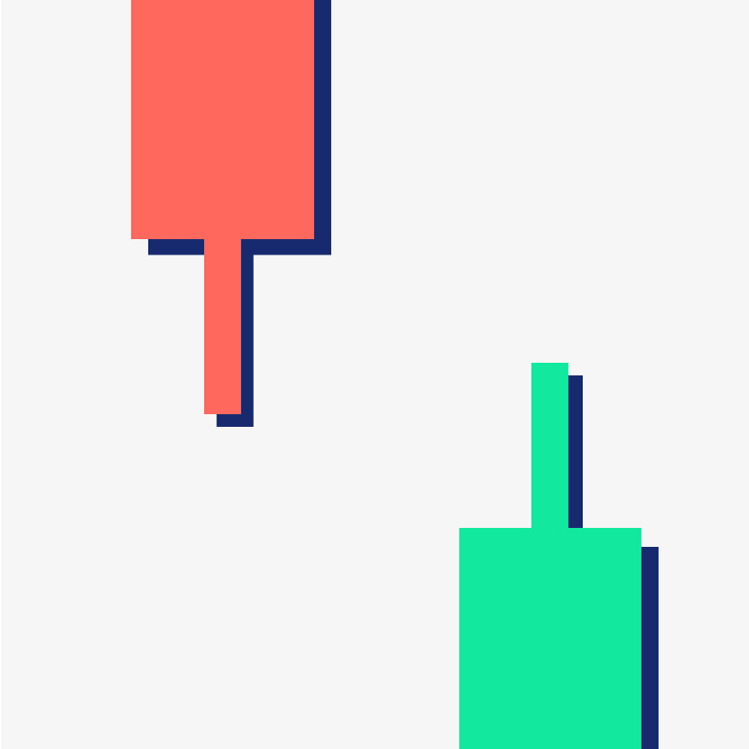
Performance: It falls and then rises again, with a long thin line at the bottom being the lower shadow, indicating strong selling pressure after the opening, causing a price drop. However, after a while, buying pressure rises, leading to a price rebound back to the highest closing price.
Conversely, if there is a strong buying support after the opening, resulting in a price increase, but after a period of time, selling pressure rises, leading to a sharp price drop.
Meaning: Accumulated for a long time and released, possibly signaling a market reversal.

Performance: If the upper and lower shadows of the candlestick are long, it indicates fierce competition between bulls and bears.
If the upper shadow is longer, selling pressure is stronger; if the lower shadow is longer, buying pressure is stronger.
Meaning: This candlestick indicates that buying and selling pressures are evenly matched and is often a sign of reversal or consolidation.
The unspoken secrets of candlestick charts
In summary, while candlestick charts can roughly indicate market trends, they do not necessarily provide all the required knowledge. Candlestick charts only show the price difference between the highest and lowest prices but do not specify which point appeared first, lacking detailed information on the gap between the opening and closing prices. Therefore, most charting tools have the functionality to zoom in on shorter time frames to provide investors with detailed information.
Candlestick charts also contain many unstable factors, especially evident in shorter time frames. The speed of candlestick transformation is very fast, with unpredictable color and shape changes, making accurate interpretation quite difficult.
Summary
Combining a series of candlesticks over a period allows the drawing of a candlestick chart that plots time against price, with the horizontal axis representing time and the vertical axis representing price. As an introductory tool for technical analysis, candlestick charts are fundamental tools; understanding them enables quick grasp of price trends in commodities or financial markets over a period. It is recommended that investment decisions utilizing candlesticks for technical analysis also incorporate other fundamental information and technical indicators to achieve more accurate judgments.
In this way, using the historical experience from candlestick charts to predict future prices, combined with fundamental value assessments and various news, investors can tailor suitable trading strategies for themselves.


